

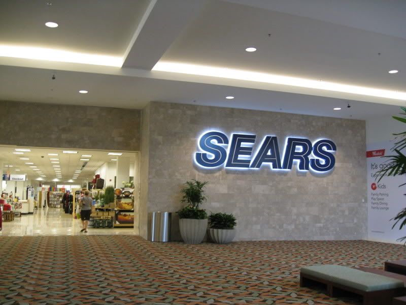
The part that strikes me as being odd was the fact that even though this entrance to the store is brand new, they opted to use the old "uppercase" logo here. I'm guessing that this was done to match the other signage on the building, which has not yet been updated to the new "lowercase" font (in fact, only a couple of the area's Sears stores have had their signage updated at this point,) but it still seems a bit odd. Has anyone else seen them do this elsewhere?
There are more pictures and info on the Southcenter expansion can be found at this post